Jill Pelto, artist and earth and climate scientist, is paving new paths for science communication.
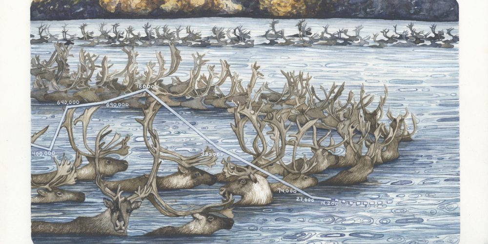
Pelto accessibly captures the urgency of scientific climate data through her watercolour art pieces.
She holds a Masters of Science focusing on the sensitivity of the Antarctic Ice Sheet and degrees in Studio Art and Earth Science from the University of Maine.
Inspired by her own field research done from high school right through to her Master’s, her father’s research, and witnessing first-hand the effects of climate change, Pelto created her first watercolour data piece in 2015 – and her art has been evolving ever since.
Her goal is to creatively communicate environmental topics to a broad audience and inspire them to learn more, and hopefully, take action.
This interview has been edited for clarity and length.
Syerra Turry: Can you tell me a little bit about the field research you’ve done?
Jill Pelto: I’ve done a lot of field research through my undergrad career and all through grad school. Actually, I started doing field research in high school because my dad is a glaciologist, and he’s been a great inspiration to me. I got to work with him on glaciers that he works on every August out in Washington State on the Alpine glaciers out there. Getting in the environment, seeing climate change first hand from a younger age – I continued to find those opportunities wherever I could in school. I worked with Dr. Brenda Hall at the University of Maine for most of my career there. In undergrad, I worked with her first in Antarctica, and then in the Falkland Islands, and then she offered me the position for a Masters for work on the Antarctic Ice Sheet, so I did more field seasons down there, including my own projects.
ST: What was your most memorable field expedition?
JP: There’s always highlights and pros and cons to every field season. I’ll talk about the Antarctic because that’s where I did my Master’s work. Working where we were was really incredible because the way the program is set up, you have these bigger bases that provide physical support for the research you’re doing down there, so having these bases is a key part of where you’re trading your supplies, and then there are temporary remote towns that allow scientists to do work that is further away from these stations which are typically closer to the coast, so my research was done in a mountain range that basically cuts across the continent and east end Arctic Ice Sheet and the west end Antarctic Ice Sheet, so that range is called the Transantarctic Mountains. Getting out to the southern portion of those is a bunch of different steps, and then you’re out where they call it the ‘deep field’ with your team. There’s four or five of us out there at a time, and so you just have your couple of tents set up. I guess just that moment, where you’re dropped off at your camp, and you’re going to be there for a month or six weeks, and you’re brought by helicopter or small plane, and you’re dropped off at that small camp, I guess you could say it feels scary, but that’s not quite the right word. But it’s a little bit daunting in a way because you look around and you can see the mountains and ice shelves and just as far as you can see – white and vast – and nothing. It’s really incredible to feel that moment: here we go, we’re out here now.
Jill Pelto, artist and climate scientist, exploring Rainbow Glacier, Mt. Baker, Washington. Photo provided by Jill Pelto.
ST: Does your field research inspire your pieces?
JP: Yes. They’ll definitely inspire future work. The first data series that I did was in early fall of 2015, and that was after coming back from working on a field season with my dad’s project in Washington State, called North Cascade Glacier Research Project.
It was one of the years where the drought was the most severe. For me, it was the most severe I personally experienced it – to see the streams and the lakes and reservoirs being so low, the glaciers having no snow on them, the way the ecology was impacted, the lack of wild flowers and things that haven’t been able to bloom and then of course the really bad fires they were experiencing.
That year, I was kind of hit in the face, like – wow, we’re experiencing so many of these factors and it was really emotional to see that and to see the glaciers being so bad. I came back from that field season and made my first data art series in an attempt to try and communicate what I saw and experienced, so I have a three part series – there’s one about the decline of the Alpine Glaciers in that area, there’s one about global temperature data and the increase of forest fires, and there’s one about salmon populations which are being really affected by the low water levels in combination with how much warmer the water is, especially when you don’t have as much of that cold glacial melt to feed it in the summer.
So that was my first series. In terms of my fieldwork inspiring my art, I haven’t done too much since doing my Master’s. I did painting on site and of the landscape when I was in Antarctica. The work that I was doing was a little bit more difficult to communicate in art-form. My first priority is to communicate through my art.
ST: What was the “aha” moment to combine environmental data and art this way?
JP: When I came back from Washington to Maine that summer and went back to school, I was in a print-making class and was trying to come up with that first idea. I realized when looking at data from my dad’s project, because my dad was doing his glacial monitoring project in that area every year for 35 years now – so he essentially has all this data about what the health of those glaciers have been over decades – it’s looking at that data line and how dramatically it drops, especially over the last decade, so I just saw that as the profile of a declining glacier.
Working with [glaciers], you get a feel for what they look like and see the really dramatic ice falls, so I saw that profile line of that of a glacier. It kind of seemed too obvious to me at first because I’m used to looking at graphs and having to make, use and read them all the time in my science classes, so I thought, graphs are pretty basic, but I realized for a lot of people, they’re not. They might look at a scientific XY graph and just kind of glaze over or have trouble interpreting what the data is really saying, so I realized it’s a really nice way to show change over time – that’s all they are. I thought that would communicate well just to my fellow art classmates who weren’t in science classes, and it did. But that was my moment, looking at that graph from my dad’s research.
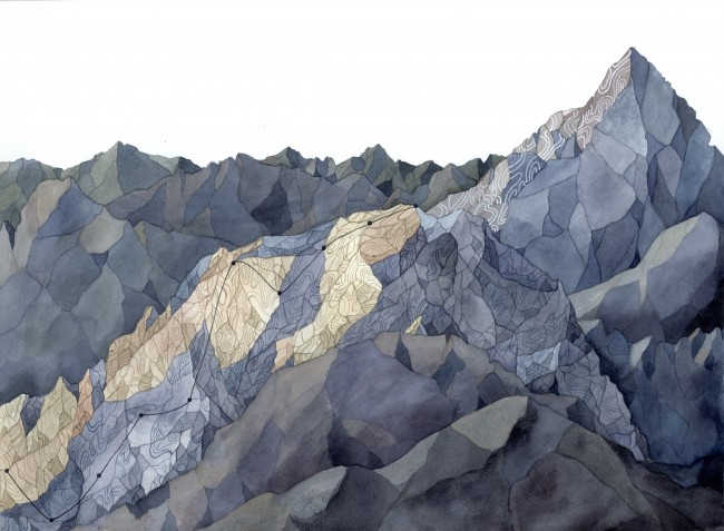
Progression uses data that shows the increase in overall use of renewable energy by the United States over the last decade. Photo provided by Jill Pelto.
ST: Do you have a favourite place or publication that your work has been featured or published in?
JP: I wouldn’t say favourite, but there are some that I’m proud of, or are special. For example, one of the first places that wrote about my work was Climate Central. I was really proud of that because I’m really impressed with how they communicate science without simplifying it too much. I’ve always been a fan of their platform.
A second example is Science Friday. They did two different pieces at the same time. One was just a piece about me and examples of my artwork, and the second feature was a curriculum or lesson plan that I had worked on with that person over the phone, and helped them design that based on my artwork. That went to schools all over the country to help them illustrate graphs. Having the kids come up with what that topic means to them and how they interpret it is really, really cool, because that was something I was able to transform into outreach. Going into schools is one thing I’m really proud of. It’s crazy to see how informed a lot of young people in the U.S are about climate change. They know so much about these topics – more than some of the adults I know. It’s just so cool to see how much they care and how much they’re learning. Of course, there’s places where that’s not true, but it’s a really important goal of mine to help inform and inspire them.
ST: Did you ever expect your work to carry that type of impact or be as far-reaching as it has been so far?
I think to expect scientists to [communicate their research] themselves is pretty unrealistic. They’re not communicators.
JP: No, and certainly not as fast as it did. As a student, I started reaching out to places, and trying to share my work. I started getting more features and it’s been a really awesome impact. I have a long way to go and it’s been really awesome that it’s reached further than I thought. You never know what other people are going to think about your idea and what it’s going to mean to them, how it’s going to communicate to them. I didn’t know that doing this data art was going to speak to a lot of different audiences of so many backgrounds and ages, so that’s really, really wonderful.
Being in the natural sciences, you learn how hard it is to communicate the research that you’re doing, even to people who are just in a different field of science. I think it’s really important to think about and figure out ways to communicate it. I think to expect scientists to do that themselves is pretty unrealistic. They’re not communicators. Some of them have those skills, and some of them definitely don’t. So working with people who don’t, that’s where I’m trying to bridge the gap. You can’t expect them to do the research and be experts on getting it out to the public too.
ST: Are you still creating data art pieces?
JP: Yeah, I am. I just finished my Master’s this past August, and I’ve made a couple pieces since then, but some of them have been commissioned.
My goal for this coming year is to start working on another body of work or portfolio that I can show. I want that portfolio to be more united from one image to the next so it can convey one image amongst a big group of paintings, now that I’m done with school, and I have the time to do so. I’m just in the early planning stages of asking myself, ‘how do I want to do this, and how do I want it to be different from the work that I have been doing, while still using the elements that have been translating well to other people?
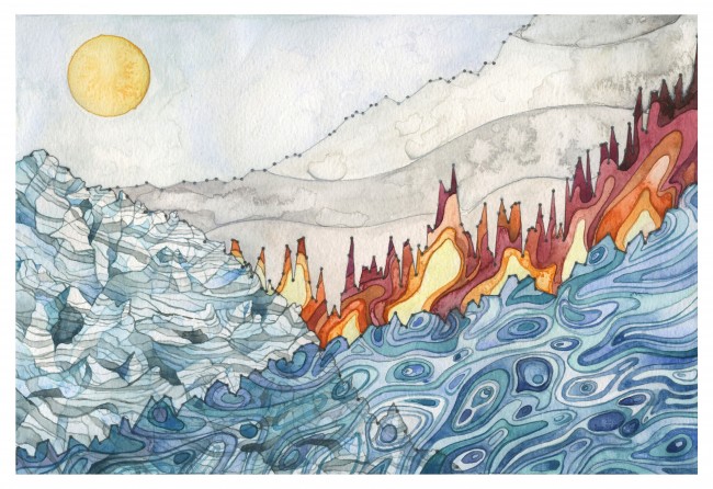
Landscape of Change uses data about sea level rise, glacier volume decline, increasing global temperatures, and the increasing use of fossil fuels. These data lines compose a landscape shaped by the changing climate, a world in which we are now living.
ST: You mentioned earlier that you were involved in developing lesson plans. Are you part of any other types of outreach projects?
JP: There’s always lots of stuff going on, lots of little things. Right now, what I’m trying to do is join on other science grants and be their outreach and communications person on different projects. Either within my field – earth and climate science – or outside of it. Right now, I’m on one grant for a team of researchers in Europe, in Sweden and Norway. They’re a paleontology research team, so studying how plant communities shifted and changed after the last Ice Age – how they adapted, and responded to warming. That’s kind of similar to my own line of research – I was studying what happened to the Antarctic Ice Sheet after the last Ice Age, and comparing that warming to now. Working on another project like that that’s not in my field of research is really exciting because I’ll get to learn about the work that they’re doing and then create a body of artwork for them, and get to do that beyond the grant itself. I’m on another grant, a glaciology grant, so that type of project is another thing that I’ve taken on right now.
ST: Why is it important to make this type of scientific research more accessible?
JP: I think there’s a lot of important research. There’s so much research constantly in any field, and for the layperson to, in the medical field for example, be aware of advances or changes or hypotheses – what the takeaways are – can be a lot of work. So, I think that’s where people bridging that gap come in, because it’s really important to be informed on things that will affect our lives and future generations.
Obviously climate change is massive because of how broadly it’s going to affect all of our lives and in such different ways depending on where we live in the world, so I think it’s really, really important to find ways to express that and find lots of different ways to express that because people are going to respond differently or learn differently. Scientific writing, publications, scientific talks and conferences are one way, but that’s only for a certain audience. I think art is one way that people are more used to responding to, and it’s part of our culture, so having that discussion in a cultural form and visual form is, I think, a good way to connect with people. It’s something they’re maybe more likely to pay attention to if they’re not already informed about it.
ST: How do you decide on research topics to illustrate?
JP: It’s often been things that I see reading online or am talking about with a friend and I’m inspired to communicate that topic – reading environmental news and researching it further and trying to learn what the topic is about. I talk to scientists in different fields to get an idea about different topics and that’s what I’ve been doing for my last few pieces, kind of a collaboration, so if I’m making a piece about something like ocean acidification or rising ocean temperatures, yes, I can communicate that that’s going on and that’s going to be affecting things, but what exactly is the story, how do I want to communicate it best so that I’m not misrepresenting the data?
For example, I did a piece this past year called the Gulf of Maine Temperature Variability and all the media stories have communicated that the Gulf of Maine is warming faster than 99 per cent of the world’s oceans, and that’s not really a good way to tell a story. It’s more of an ‘oh my god, this is happening’, and, what’s really happening is the temperature swings are really dramatic – there have been fast rises and they have dropped too, and it’s been hard for the species to keep up. But that’s not as simple to tell as a story. But, that’s the story I’d rather tell – the true one, than just say, this is happening so fast. It’s choosing something, even if it’s something more complex, and trying to communicate it well, and choosing something that I think is important. At the end of the day, it’s ‘what do I want to communicate right now?’
ST: So, your goal is for your pieces to be able to convey more of a complete story, rather than alarming statistics?
JP: Yeah, definitely. That’s why I think my pieces are stronger when they’re paired with a description for people to be able to take away information a little bit closer afterwards. People can read about it and see what I was trying to communicate and know what the data is about.
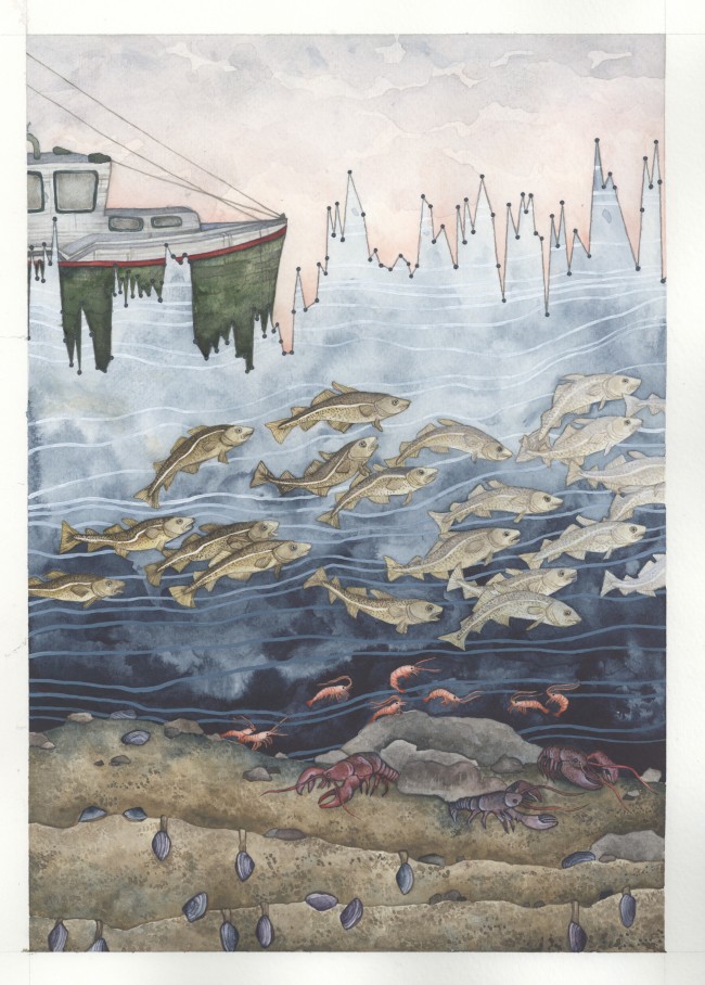
Gulf of Maine Temperature Variability tells the story of increasing temperature fluctuations in Maine’s coastal marine environment. The watercolor uses ocean temperature data from the past 15 years to highlight how greater variability affects various species including ourselves.
ST: When you’re creating your pieces, do you more often have a concept or topic in mind and then find supporting data, or do you find data and think of ways to illustrate it?
JP: I’ve done both. I think I’ve more often chosen a topic then researched it. Sometimes finding the data you have in mind, it doesn’t exist or you can’t find it from a source that seems reliable. I’ve done both, but I usually choose a topic first. Occasionally I have seen data, like when I saw the Arctic Sea Ice Decline graph, I was like, ‘oh, I want to make a piece out that.’ It goes both ways.
ST: Are you driven more by art or science? Would you consider yourself an artist first, or a scientist first?
JP: That’s tough, and that’s something I’ve thought about a lot. Since August, being done grad school, I do miss that environment a lot. I love being in the community of scientists, and so, it’s hard to say. I think I’m both. I loved the field I was in and I loved my Master’s program and everyone there, but I had a hard time really focusing in on one topic, as you have to do in a degree, and I think that art is allowing me to be broader and learn about lots of different types of science and research projects. That’s why I’m trying to join grants because then I can see in the science community and learn about different research and help with it, but I don’t know. In terms of doing lots of different art and making that a career, I don’t know what that looks like. I would love to be in the sciences too, but I don’t know what that looks like in terms of doing that full-time. If I were to do that, I really wouldn’t have the time and energy that I personally want for art, so I’d like to find a way to still be in both worlds. But, right now, I’m choosing art because that’s allowing me to do both a little more than if I were just in science.
ST: What are your long-term goals?
JP: To make a career out of doing both art and science and to always be involved in both worlds, so, to be able to do that full-time is my ideal, and just being able to continue to evolve in the work that I do and reach different audiences, and connect with people from different backgrounds and do more collaborations with other scientists and artists, or anyone else that can help in terms of communication of environmental issues. We were talking about before, finding ways to start to direct that to action when possible, so doing this for my career, that’s my goal, that’s what I really love.
ST: Do you have any final comments that you would like to add?
JP: I think it’s smart right now to think about what kind of changes might be happening in the areas where we live, and taking a moment to learn. There are websites now, to look at the climate history of where you live – you can look at what’s projected for the future, and just be aware and conscious, and also not be afraid to talk about it, and making it part of daily conversations. If we’re having really severe weather or something that’s not typical for the area you live, call it out as it is, and engage more people about it. Some people aren’t going to want to hear about it or won’t talk about or will turn you down but, just using that in our daily lives a little more, and being realistic and honest. That doesn’t have to be negative at all, because that’s how we’re going to make a change – by coming together more. That’s something I truly believe in.
You can find more of Jill Pelto’s work here: http://www.jillpelto.com/
Syerra is currently an Environmental Visual Communications student with Fleming College and the Royal Ontario Museum. She holds a degree in journalism and sociology and hopes to explore new ways to effectively communicate today’s environmental issues.


